.png)

Most "best knowledge base examples" articles list the same aspirational sites: clean homepage, prominent search bar, polished category cards. They are useful for design inspiration and almost useless as a benchmark, because the surface tells you nothing about what matters most. You cannot tell, by looking at the homepage, whether the articles inside are still accurate.
This guide lists twelve SaaS help centers from companies that ship product changes every week. Linear, Stripe, Vercel, Notion, Webflow, Loom, Intercom, Slack, Figma, Productboard, Dropbox, Sentry. Each section covers what the help center does well, the specific layout or search choice worth copying, and the limit that copying alone will hit. At the end, there is a fifteen-point self-assessment you can run against your own help center in under an hour.
The pattern across all twelve: visible structure is solved. Invisible drift is not. The best help centers in the world still contain articles that describe buttons which no longer exist. You will not see this from the homepage. Visitors do.
1. Linear: minimal hierarchy, command-K search
Linear's docs at linear.app/docs are an extension of the product aesthetic. Calm typography, almost no chrome, a sidebar with one heading depth, and a search experience that mirrors the in-app command palette. There is no "popular topics" carousel and no marketing banner. The page assumes you arrived knowing what you wanted.
What works:
- One-layer category tree. Ten top-level groups, each with a short list of articles, no deep nesting. A visitor never has to guess which sub-folder a question lives in.
- Search as the default action. The keyboard shortcut surfaces a fuzzy search overlay identical to the one inside the product, so the muscle memory transfers.
- No popular topics module. Linear's audience is technical and uses search. Skipping the curated "popular" row keeps the page calm.
- Article density. Each article is short, scoped to one task, and ends without an upsell footer.
The limit: Linear's audience is forgiving. A consumer-grade audience would expect a hand-held landing experience with categories laid out as cards. Copying Linear's minimalism without matching the audience leaves visitors stranded.
2. Stripe: dual navigation for use case and product
Stripe's docs at docs.stripe.com have two navigation systems running in parallel. The first is use-case oriented: "accept payments online," "set up subscriptions," "build a marketplace." The second is product-oriented: Payments, Connect, Billing, Tax, Sigma, and so on. New developers enter through use cases. Existing developers navigate by product.
What works:
- Two entry points for two audiences. Onboarding readers and reference readers want different shapes of navigation. Stripe ships both without making either feel secondary.
- Inline code samples in every common language. Tabs switch between Python, Node, Ruby, Go, PHP. The reader does not lose context.
- Quickstarts before reference. The "get started" path lands you on a working integration in under ten minutes, before any deep reference appears.
- Last-updated date on technical pages. Reference pages carry an explicit revision date, which the casual help center pages skip.
The limit: maintaining two parallel structures is expensive. Stripe has a dedicated docs team. Smaller teams that copy the dual model end up with one navigation drifting out of sync with the other.
3. Vercel: framework-first, last-updated metadata in the source
Vercel's docs at vercel.com/docs open with a framework grid (Next.js, Astro, Nuxt, SvelteKit, etc.) because the first question every visitor asks is "does this work with my stack." The structural choice is to lead with the user's framing, not the company's product taxonomy.
What works:
- Framework grid as the first decision. Visitor self-selects in two seconds.
- Knowledge base section split from product docs. Conceptual guides and tutorials live under /kb, separate from API reference, with their own topic tags.
- Source carries a last_updated field. The metadata is in the page source even if the rendered page does not always show it, which is one of the few public signals of internal freshness discipline.
- Use-case index for AI workloads. A discrete section for AI infrastructure, separated from the general docs, reflecting how the product is evolving.
The limit: the framework-first model only works when the product genuinely runs across many frameworks. For a single-product SaaS, this approach collapses into a list of one.
4. Notion: extensive sidebar, popular topics, academy
Notion's help center at notion.com/help covers a wider product surface than almost any other example on this list, and it stays organized by leaning hard on a left sidebar with deep but scannable categories. The landing page leads with a friendly question ("Hi, how can we help?") and immediately shows popular topics, then a What's New section, then the Notion Academy.
What works:
- Popular topics as visual cards. Six cards above the fold, each one a high-traffic question. New visitors find their answer without typing.
- "What's New" feed. Recent product releases are surfaced inside the help center, which keeps the help center connected to the product calendar instead of operating as a separate world.
- Academy as a parallel surface. Long-form courses live next to short articles, addressing a different learning intent without polluting the help articles themselves.
- Browsable by use case and by role. The Guides section lets readers self-select by audience (engineering, design, HR) on top of by topic.
The limit: Notion has the bandwidth to maintain three parallel learning surfaces. Most SaaS teams cannot. Copying the structure without the team behind it produces three half-finished sections.
5. Webflow: video-first, course-quality production
Webflow runs two complementary surfaces: help.webflow.com for written articles and Webflow University for video courses. The video surface is the differentiator. Most help centers treat video as a nice-to-have. Webflow treats video as the primary medium for any topic that needs to show a UI flow.
What works:
- Course-structured video paths. Beginners can follow a numbered sequence from "intro to designer" through "publish your first site," instead of hunting article by article.
- Article and video for the same topic. Most concepts have both, so readers self-select their preferred medium.
- Production value high enough to feel like the product brand. No screen-recordings with raw audio. The video brand and the product brand are the same.
- Search across both surfaces. One search query returns articles and videos together, ranked.
The limit: video ages faster than text. A Webflow University course recorded against last year's Designer UI will visibly date the moment a panel moves. The decision to invest heavily in video is a decision to commit to a re-recording cycle.
6. Loom: six-card resource hub (post-Atlassian acquisition)
Loom's support center now lives at support.atlassian.com/loom following the Atlassian acquisition. The landing page is six resource cards: Documentation, Knowledge Base, Community, System Status, Suggestions and Bug Reports, Billing and Licensing. Pure routing. The page does not try to answer questions itself.
What works:
- Card-based routing. Six choices, each one a clear destination. A visitor decides in seconds.
- System Status surfaced at the top level. When a service is degraded, the support center is the right place for that signal, not buried in a footer.
- Roadmap link. The roadmap is treated as a support asset, which closes the loop between "this is broken" and "this is being fixed."
- Community and ticket routing both visible. Self-serve and human-supported paths are offered as equals, not with the human path hidden.
The limit: the support center delegates the answering work to the documentation and knowledge base sections behind the cards. If those surfaces lag, the cleanliness of the front door does not save the experience.
7. Intercom: category counts and contributor visibility
Intercom's help at intercom.com/help shows a number on every category. "Fin AI Agent, 16 authors, 128 articles." "Inbox, 22 authors, 109 articles." Most help centers hide their size. Intercom advertises it.
What works:
- Visible article count per category. Sets expectations. A visitor knows whether they are entering a five-article section or a hundred-article section.
- Visible contributor count. Signals that real humans maintain this, not a single team behind a CMS.
- Prominent search. The search bar is the dominant visual element on the page.
- Topic groupings aligned to product surfaces. Fin, Inbox, Workflows, Knowledge, Outbound. Every section maps to a product area the customer already knows.
The limit: showing article counts is a vanity metric if the articles are stale. A category with 138 articles, half of which describe a workflow that has since been redesigned, is worse than a category with 60 current ones.
8. Slack: six categories, three quick-access queries
Slack's help at slack.com/help is one of the cleanest examples of category discipline. Six top-level categories, each with a one-line description. Above them: a search bar with the headline "Hi. How can we help?" and three quick-access queries shown as buttons (add people to channels, reset password, upgrade your plan).
What works:
- Six top-level categories. Below the cognitive load ceiling for a landing page. A visitor scans them in one glance.
- One-line description per category. Reduces "what does that category actually mean" lookups.
- Three quick-access queries. Hand-picked by the support team based on real search data. Most visitors click one of the three.
- Language switcher in the header. Multilingual surfaces are equally prominent, not buried.
The limit: the cleanliness depends on Slack's support team making active editorial choices about which six categories deserve top-level status. Without that discipline, the page balloons into eleven categories within a year.
9. Figma: product-bucketed across many sub-products
Figma's help at help.figma.com faces a structural problem most help centers do not have: Figma is now multiple products (Figma Design, FigJam, Dev Mode, Figma Slides, Figma Make, Figma Buzz, Figma Sites). The help center buckets articles by product, with new products explicitly flagged as "New."
What works:
- Top-level product selector. A user knows which product they are using and picks first.
- "New" tags on emerging products. Sets expectations that documentation may be thinner.
- Administration split from product docs. Account, billing, teams, and enterprise live in their own branch, separate from feature documentation.
- Featured video courses. A handful of curated video paths sit alongside the article tree.
The limit: product-bucketed navigation breaks when a user does not know which product owns the feature they are looking for. Cross-product features (a comment that lives in both FigJam and Design) end up duplicated or under-documented.
10. Productboard: Zendesk Guide done well
Productboard's support center at support.productboard.com runs on Zendesk Guide, which most teams use the same way and most teams use forgettably. Productboard's version is worth studying because they removed Zendesk defaults and replaced them with brand-aligned categories and a topic hierarchy that maps to the product's mental model.
What works:
- Categories named in product language. "Insights," "Features," "Roadmap," "Releases." A user who has used Productboard recognises the words from the product UI.
- Promoted articles in each section. A small set of starred articles surfaces at the top of each category, set by the support team.
- Visible last-updated date on most articles. Productboard chooses to display the metadata, which most Zendesk Guide implementations leave hidden.
- Webinar and community links from the help center. The support center routes to higher-bandwidth surfaces when an article is not enough.
The limit: Zendesk Guide is a template. The freshness work still happens in writers' heads. The visible last-updated date does not guarantee the article is current. It guarantees a writer touched it on that date.
11. Dropbox: three-bucket simplicity at scale
Dropbox's help at help.dropbox.com uses three top-level buckets: Account, Using Dropbox, and Products. Three. That is the entire top level for a help center serving roughly seven hundred million users.
What works:
- Three buckets. The minimum viable top-level structure. Everything reachable in two clicks.
- Frequently asked questions block. Four FAQ entries on the homepage answer the most common high-volume tickets without a click.
- Twenty-plus languages. Localisation is not a marketing claim. It is operational and visible from the language picker.
- Three escalation paths visible. Community, support ticket, and Dropbox Learn courses, all reachable from the landing page.
The limit: three buckets work when the product line is mature and stable. Dropbox has had years to settle on these labels. A pre-revenue SaaS that copies "Account, Using, Products" before its product surface has settled ends up with categories that do not describe their contents.
12. Sentry: platforms-first, .md endpoint per page
Sentry's docs at docs.sentry.io lead with platforms (20+) and frameworks (60+) because Sentry's audience self-selects by stack before anything else. The detail worth copying: every page is also available as raw Markdown by appending .md to the URL, designed explicitly so AI coding assistants and LLM-based agents can ingest the docs cleanly.
What works:
- Platform-first navigation. Twenty languages and runtimes at the top level, each as a separate entry.
- Framework second level. Sixty frameworks under their parent language, no cross-pollination.
- .md endpoint on every URL. Raw Markdown for any docs page, addressed as a feature, not a bug.
- Agent-specific documentation. A discrete section for "Sentry for AI" anticipating that increasingly the readers are agents, not humans.
The limit: platforms-first only works when the product is a developer tool. For a customer-facing SaaS, the equivalent decision (audience type or use case) needs the same level of discipline, and rarely gets it.
What every great help center shares
Twelve different products, twelve different audiences, and the same handful of choices keep showing up. If you study these examples for design ideas, look for the patterns, not the specific layouts.
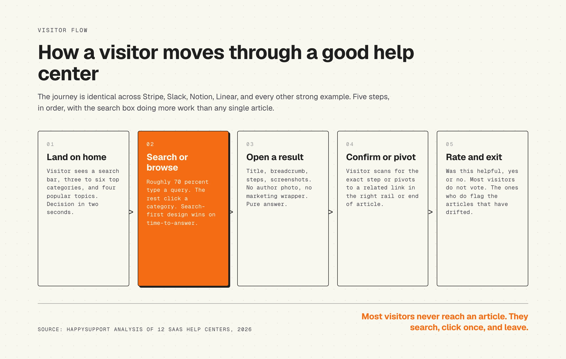
- Search before browse. The search bar is the most prominent element on every landing page. Categories exist for the visitor who does not know what to search for.
- Three to six top categories. Beyond six, scanning fails. Dropbox lives at three. Slack and Loom at six. Above ten, the visitor disengages.
- Popular topics curated by hand. Three to six high-traffic queries surfaced as quick-access buttons or cards, set by the support team based on search data.
- Consistent article shape. Same heading style, same code-block style, same screenshot frame, same "Was this helpful" widget at the bottom. The visitor learns the shape and reads faster.
- Internal linking within articles. Every article ends with related links, not just a back-to-top button.
- "Was this helpful" widget. Yes or no. Not five stars. The data is binary and the feedback rate is low, but the no-clicks point straight at the articles that have drifted.
- Last-updated date displayed. Stripe, Vercel, and Productboard show it. Most others do not. The ones that show it are signaling discipline.
- One brand voice across articles. The voice in a Linear help article reads like a Linear product release note. Same for Stripe, same for Notion. No tone whiplash between articles written by different team members.
None of these are radical. They are table stakes. The question is not whether your help center should adopt them. The question is what comes next.
What they all get wrong: freshness is invisible
Click around any of the twelve help centers above and the front door looks great. Now open a random article in one and check it against the live product. You will almost always find at least one of these: a screenshot of a UI that has been redesigned, a step that references a menu item that has moved, a code sample for an API version two majors behind, a price that ticked up six months ago, a feature flag that has been removed.
This is not a criticism of any of the twelve. It is what happens to every help center over time. An audit of thirty SaaS help centers we ran in early 2026 found that the median article was 14 months past its last review, and that 37% of articles contained at least one element (UI element, price, plan name) that had drifted since publish.
The hard part is that you cannot see this from the homepage. Visitors can. They open an article, follow step three, find the button is no longer where the screenshot shows it, close the tab, and open a ticket. The help center looks great. The behavior shows the cost. This is the hidden cost of documentation decay: every stale article is a deflection rate leak.
The reason this gap persists in even the best examples is that the fix is not visible either. It is process and tooling: a named owner per article, a review trigger that fires when the underlying code changes, a CMS that flags articles whose source UI has shifted. None of that shows up in the front-door design. All of it determines whether the help center is still useful in 18 months. See how a help center differs from a knowledge base on this dimension.
How to benchmark your own help center: a 15-point self-assessment
Run this against your help center in under an hour. Score one point for each yes. Below ten and you have foundational work to do. Twelve to fifteen and you are inside the cluster the twelve examples occupy. Even at fifteen you still have the freshness problem.
- Search bar is the dominant element on the landing page, not buried in a header.
- Six or fewer top-level categories.
- Each category has a one-line description on the landing page.
- Three to six "popular topics" are surfaced above the fold, hand-picked from search data.
- Search returns relevant articles in the top three results for the ten most-asked support questions.
- Every article uses the same heading hierarchy, image frame, and call-to-action style.
- Every article ends with two to four related-article links.
- Every article ends with a "Was this helpful" widget that captures real signal.
- Every article displays a last-updated date.
- Every article has a named owner (visible internally, not necessarily public).
- Articles describing UI flows have screenshots, and the screenshots match the current product.
- Articles referencing pricing or plan names match the current pricing page.
- The help center surface is one to two clicks from the in-app help icon, with relevant articles deep-linked by context.
- The team has a review trigger that fires when the underlying product element changes (release-tied, not calendar-tied).
- Articles failing the "Was this helpful" vote are flagged for review automatically, not at quarterly audit time.
If you score ten or higher on the first nine, your front door is in the top decile. Points ten through fifteen are where the work compounds. Most teams stop at nine, ship the homepage, and then watch the back half quietly decay. See how a better help center reduces support tickets for the business case.
Where HappySupport fits
The twelve examples above all solve the front door. None of them solve the freshness problem at the back, because the freshness problem is not a design problem. It is a process and tooling problem.
HappySupport is the help center built around the answer to that question. The HappyRecorder Chrome extension records UI flows as references to UI elements rather than as flat screenshots, so when the underlying product changes, the system knows which articles to flag. The GitHub Sync layer connects every article to the relevant area of the product code, so a deploy that changes a screen triggers a review on the documentation that describes it. The front-door experience matches what visitors expect from a strong help center: prominent search, scannable categories, consistent article shape. The back-of-house work is what makes the front door still accurate next quarter. See how a self-updating help center works for the architecture, and our ranked breakdown of knowledge base software for how the category compares.
The twelve examples are worth studying for design ideas. Just remember that designing a beautiful homepage is a one-time project. Keeping the articles inside it accurate is a recurring one.