The best SaaS onboarding emails share one thing the worst ones never get right. They link to a specific help article, not the help center home page. When a user clicks "Set up your first project" and lands on a generic landing page with a search bar, the email failed. The CTA promised a step. The destination delivered a catalog.
We pulled apart the onboarding emails from 12 SaaS companies that have a reputation for doing this well. Linear, Vercel, Notion, Webflow, Loom, Figma, Stripe, Slack, Calendly, Cal.com, Lemlist, and Product Hunt. None of these are perfect. Each one does one thing that is worth stealing for your own sequence. The patterns repeat across all 12. One job per email. One CTA. One link target. Everything else is friction.
This is an examples piece, not a theory piece. Every section below describes what the email does, what works, and what to take into your own sequence. Where the email content is paraphrased, it is paraphrased. We do not claim verbatim text from any of these companies, because email copy changes monthly and we are not in their analytics. The patterns are stable. The exact wording is not.
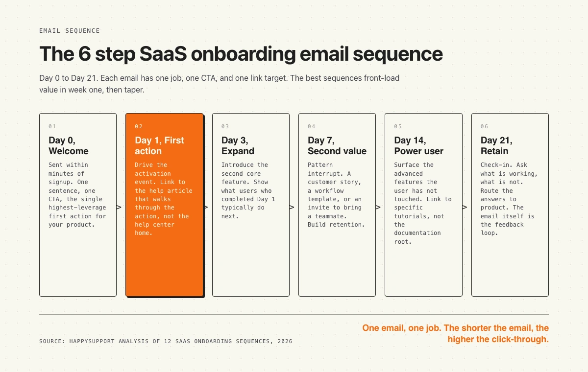
The 6 step onboarding sequence at a glance
Before the examples, the shape. Most strong sequences run six to eight emails across three weeks. Day 0 welcome, Day 1 first action, Day 3 expand, Day 7 second value, Day 14 power user, Day 21 retain. The first email lands within minutes of signup. The rest taper. Front-load week one. That is where engagement is highest and where most users churn if you fail to reach them.
The diagram below maps each step to a single job. Read it as a checklist for your own sequence. If any of your emails do more than one job, the email is too long.
1. Linear: confirms signup and gets out of the way
Linear sends a short welcome email that does almost nothing. No product tour. No feature checklist. A single line that confirms the account, a one-click link to open the workspace, and the signature of a real human on the team. The email is doing one job. Get the user back into the product.
What works:
- Single CTA. One button. One destination. The workspace, not the docs.
- No fluff. Six lines of text. The user knows what to click in under three seconds.
- Human signature. Sent from a named team member, not a noreply address.
- Plain text feel. Looks like an internal Linear message, which reinforces the brand.
Steal this for your sequence: if your welcome email cannot be read in under five seconds, cut it in half. Then cut it in half again.
2. Vercel: ships the first action in the welcome email
Vercel does not separate "welcome" from "first action." The welcome email is the first action. It points the user at a one-command deploy with the framework they picked at signup. The user goes from inbox to deployed site in roughly two minutes. The email is doing the activation event itself.
What works:
- Activation in inbox. The first email is the first deploy. No second click needed.
- Framework-specific. The CTA matches what the user told them at signup. Personalization at the level the user cares about.
- Code block. The CTA is a copyable command, not a marketing button.
- Help link. Inline link to the deploy guide for that specific framework, not the docs root.
Steal this for your sequence: ask one question at signup that lets you personalize the first email by use case. Frame the welcome email as the first product action, not a preamble to it.
3. Notion: shows what is possible, then asks one question
Notion's welcome email leads with a gallery of templates and customer use cases before asking the user what they want to build. The email does light segmentation. The reply path branches users into different follow-up sequences based on their answer. The trade-off is that the email is longer than Linear or Vercel. The payoff is that every email after Day 0 is targeted.
What works:
- Show before tell. Templates do the explaining. Less copy to read.
- Branching question. One question segments the user. Future emails get more relevant.
- Template links. Each template card links to the template page with a one-click "duplicate" button, not the marketing site.
- Founder voice. Tonally personal, which lifts reply rates compared to corporate welcome emails.
Steal this for your sequence: if you cannot personalize at signup, personalize at first reply. Ask one question. Branch the sequence.
4. Webflow: links every step to a specific tutorial
Webflow's onboarding emails treat the help center as a partner, not an afterthought. Every CTA in the sequence links to a specific tutorial article for the action being prompted. Not the docs home. Not a search result. The exact article that walks through that one step. When the user clicks "Start your first project," they land on the "How to start your first Webflow project" article, with screenshots and a video at the top.
What works:
- Deep links. Email CTA targets the specific article, never the help center root.
- Tutorial first. The article is structured for someone who just clicked from the email, not someone who searched.
- Video at top. Three minute walkthrough above the fold of the help article.
- Progress chain. End of each article links to the next step's article. The whole onboarding flow lives in the help center, not the email.
Steal this for your sequence: build one help article per email in your sequence. Each article is the destination of one CTA. No generic "learn more" links.
5. Loom: video in the welcome email
Loom embeds a 90 second product video as the centerpiece of the welcome email. The video is a real Loom recording, which doubles as a product demo and a use case. The user sees what the tool produces before they touch the tool. The video has a CTA at the end that lands the user on the recording screen.
What works:
- Show the output. The user sees what a Loom looks like before being asked to record one.
- Recording is the demo. The product makes the marketing asset. Loops back to brand.
- Single CTA. Start recording. One destination.
- Mobile-friendly. Video thumbnail loads as image fallback when video does not autoplay.
Steal this for your sequence: if your product is visual, lead with the artifact, not the description. A 90 second video beats 400 words.
6. Figma: invites a teammate as the activation event
Figma treats the second email in the sequence as a teammate-invite prompt. The reasoning is straightforward. A solo Figma user churns. A Figma user with two teammates in the same file stays. The email frames the invite as collaboration, not seat expansion. The CTA opens an invite modal with a pre-filled link, not a settings page.
What works:
- Multi-user as activation. The activation event is a second user, not a feature touched.
- One-click invite. The link drops the user into the invite modal with a copyable URL ready.
- Frame as collab. The copy talks about "sharing this file," not "adding seats."
- Social proof. Mentions other teams in the user's industry, without naming customers in a way that feels manufactured.
Steal this for your sequence: if your product gets stickier with more users, an invite is a stronger activation event than a feature touch. Make the invite one click, never a settings dive.
7. Stripe: documentation as the welcome email
Stripe sends a welcome email aimed at the developer who just created an account. The body is mostly a code snippet for the first API call, plus a link to the test mode dashboard. The email assumes the reader is a developer with a terminal open. The copy matches the audience. No marketing language. The deep link goes to the API reference, not the marketing site.
What works:
- Audience-matched voice. Developer email speaks developer. No "delighted to have you."
- Copyable code. The first action is a curl command in monospace.
- Test mode highlighted. The CTA reassures the user that experimenting is safe.
- Dashboard link. The secondary link is to the test dashboard, where the user sees their first event after the first API call.
Steal this for your sequence: if your buyer is a developer, write the email in a terminal voice. If your buyer is an operator, write in an operator voice. Audience match beats voice consistency.
8. Slack: re-engagement before churn
Slack's onboarding sequence does something most SaaS companies skip. It sends a re-engagement email between Day 10 and Day 14 to users who signed up but never returned. The email reframes the gap as a question, not a guilt trip. "Forgot why you signed up?" with a single CTA back to the workspace. No checklist. No upgrade pitch.
What works:
- Question framing. The subject line is a question, which lifts open rates over declarative.
- No guilt. The copy does not reference the user's absence.
- One-click return. The CTA is a magic link that opens the workspace, no password.
- Timing. Sent before the user has emotionally written off the product, usually before Day 14.
Steal this for your sequence: build a re-engagement email for inactive signups. Send it between Day 7 and Day 14. Frame the subject as a question.
9. Calendly: stops emailing the moment the user activates
Calendly does the smartest thing in the sequence. It stops. The moment a user creates their first event type and books a meeting, the rest of the onboarding sequence is cancelled. The user never receives the Day 7 "did you book a meeting yet" prompt that they would find condescending. The email stack respects activation.
What works:
- Activation-gated. Sequence pauses on activation event. Most products miss this.
- Conditional sends. Future emails check state before firing.
- Trust signal. The user notices that the product knows they activated. Increases trust.
- Switches to retention track. Activated users get the power-user sequence, not more setup nudges.
Steal this for your sequence: every email in the sequence should check whether its job is still relevant. If the user already did the thing, do not send the email.
10. Cal.com: open source as a brand cue
Cal.com's onboarding email leans into the open source positioning that differentiates it from Calendly. The email mentions GitHub, the public roadmap, and the community Slack alongside the activation CTA. The user picks up the brand signal immediately. The deep link is to the integration setup, not the marketing site.
What works:
- Brand-aligned copy. Email reinforces the differentiator, not the parent category.
- Community link. Secondary CTA goes to GitHub or community, signals depth.
- Single primary action. Despite multiple secondary links, one button dominates.
- Plain HTML. The visual feel is engineering-first, which matches the brand.
Steal this for your sequence: do not write the welcome email as a generic SaaS welcome. Write it the way only your brand can write it.
11. Lemlist: founder reply chain
Lemlist runs the welcome email as a one-to-one looking message from the founder. Plain text. No graphics. No HTML formatting. A single question at the end asking the user what they are trying to accomplish. The replies route to the success team, which uses them to personalize the rest of the sequence. The plain-text format also drives higher reply rates than designed HTML emails.
What works:
- Plain text. Looks like a personal email, not a marketing send.
- Founder voice. The signature is the founder, not "the team."
- Open question. The CTA is a reply, not a click.
- Personalization downstream. Replies inform the next emails in the sequence.
Steal this for your sequence: at least one email in the first week should ask the user to reply. Reply rate is a stronger engagement signal than click rate.
12. Product Hunt: community as activation
Product Hunt's welcome email frames the community as the product. The first CTA is to upvote a featured product of the day. The activation event is participation, not consumption. The email teaches the new user how the community works by giving them one small action they can take in 10 seconds.
What works:
- Activation is participation. The first action is one upvote, not a profile setup.
- Low friction. The CTA takes less than 10 seconds.
- Community-first language. The email talks about the community, not the platform.
- Notification setup. Secondary link is to set notification preferences, prevents future unsubscribes.
Steal this for your sequence: pick the smallest possible first action that signals engagement with your product's core loop. Make that the welcome email CTA.
Common patterns across all 12
Pull the 12 examples apart and the same five patterns repeat. None of these are secrets. All of them are skipped by most companies running an onboarding sequence.
One job. Every email in the sequences above does exactly one thing. Confirm signup. Drive first action. Invite teammate. Re-engage. The moment an email tries to do two jobs, click-through drops.
Deep links. The CTA in every email points at the specific destination for that one action. Vercel links to the framework deploy guide. Webflow links to the project setup article. Linear links to the workspace. None of them link to the help center home page.
State-aware sending. The best sequences check what the user already did. Calendly stops emailing on activation. Slack only sends the re-engagement email to inactive accounts. Static schedules without state checks waste sends and erode trust.
Audience-matched voice. Stripe writes for developers. Notion writes for makers. Linear writes for engineering teams. The voice is not consistent across companies. It is consistent within each company's audience.
Shorter is stronger. The strongest examples in this list are under 100 words of body copy. The weakest sequences in the SERP are 400 words plus. The math is clear. Shorter emails get read. Read emails get clicked.
Mistakes to avoid in your onboarding sequence
Five anti-patterns that show up in most SaaS onboarding sequences we audit. Each one is easy to fix.
Generic links. The single most common mistake. The email CTA is "Learn more" and the destination is the help center home page with a search bar. The user has to do the work the email should have done. Fix: every CTA in the sequence links to the specific article for that step.
Too fast. Some sequences fire four emails in the first 48 hours. The user marks them as spam. Onboarding emails should respect the user's pace. Day 0, Day 1, Day 3 is enough for week one. Day 7, Day 14, Day 21 covers the rest.
No state check. The "did you finish setup" email arrives the day after the user finished setup. Trust dies. Every email in the sequence needs a conditional check on whether its job is still relevant.
Marketing voice. "We're so excited to have you on board" wastes the first line of the welcome email. The user did not sign up to feel welcomed. They signed up to do a thing. The first line should point at the thing.
Static screenshots. Many onboarding emails embed product screenshots that show a UI version from six months ago. The user opens the product and the UI looks different. Trust erodes. Either link to a live source of truth, or remove screenshots from emails entirely.
How help articles fit into onboarding emails
Every email in the sequences above has at least one link. The link goes somewhere. The question is where. The companies in this list link to specific help articles for specific actions. The companies that struggle link to the help center home page or, worse, to the marketing site.
The shift looks small but the conversion difference is large. When a user clicks "Set up your first event" in a Calendly email, they need to land on the article that walks through setting up the first event. Step one, step two, step three, screenshot at each step, video at the top. Not a search page. Not a list of categories. The email made a promise. The article keeps it.
Two things break this. First, the help article does not exist yet. The growth team writes the email faster than the docs team writes the article. The CTA lands on a 404 or a generic page. Second, the help article exists but is out of date. The screenshots show last quarter's UI. The steps reference a feature that moved. The user trusts the email, opens the article, and the article tells them the wrong thing. The whole sequence loses credibility from that one click.
The fix is structural, not editorial. Map every email in your sequence to a specific help article. Treat the article as a hard dependency for shipping the email. And then keep the article current as the product ships. Documentation decay is the silent killer of onboarding sequences. The email stays the same. The product changes. The article gets stale. The CTA still points at the article. The new user lands on something that used to be true.
According to Wyzowl's onboarding research, 86 percent of users say they are more likely to stay loyal to a business that invests in onboarding content. The investment is not just writing the article. It is keeping the article alive as the product ships. That is where most SaaS companies lose.
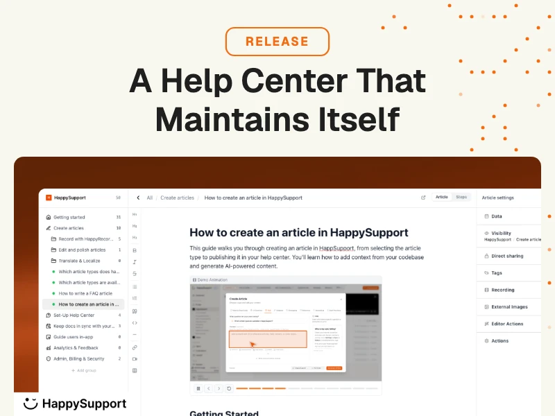
Where HappySupport fits
The reason we wrote this piece is the same reason we built HappySupport. The best SaaS onboarding emails link to specific help articles. The best help articles stay accurate every product release. Most help articles do not. The article you wrote six months ago references a button that moved, a setting that was renamed, a feature that ships differently now. The onboarding email still points at it.
HappySupport is the help center layer that keeps itself current. When the product ships, the article updates. When the UI moves, the steps stay accurate. When a new user clicks the CTA in your onboarding email and lands on the help article, the article reflects the product they just signed up for, not the product from last quarter. That is what makes the deep link actually work.
If your onboarding sequence already exists, the gap is usually in the article layer underneath it. Run an audit of how your help center handles the deep-link traffic from onboarding emails and look at the bounce rate per article. The articles with the highest bounce are usually the most out of date. Fixing the article layer fixes the conversion rate of the email layer above it. Both layers need to be current. Our self-updating help center approach keeps the article layer accurate without a manual review every release.