If you are a SaaS product manager looking for product onboarding software, this list is for you. Most "best onboarding tools" articles mix in customer success platforms, ticketing tools, and HR onboarding. They miss the workflow that actually matters to a PM: ship a feature, drive activation, measure adoption, iterate.
This article picks 8 product onboarding tools that fit the PM loop. Six are in-app guidance platforms (tooltips, tours, checklists, feature announcements). Two are doc-layer tools that sit beside the in-app tour to keep the underlying knowledge current as the product ships. Pricing is verified directly from each vendor's pricing page as of May 2026. No estimates, no fabricated tiers.
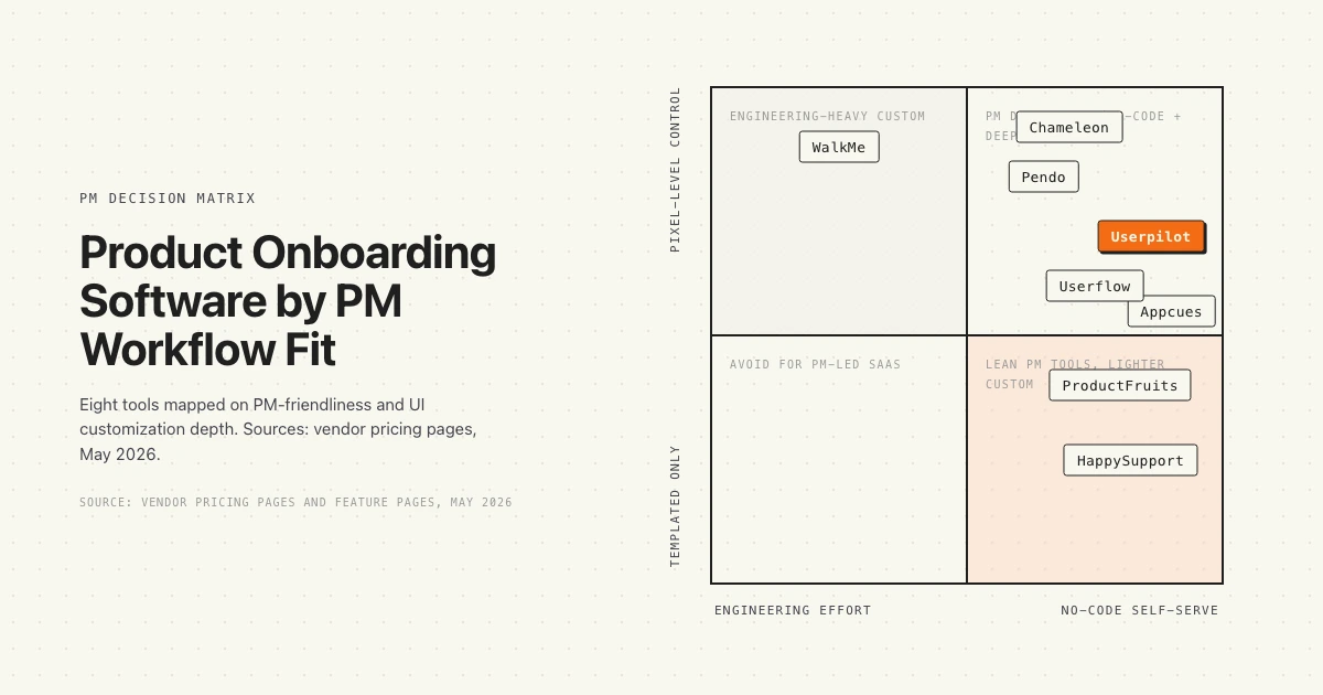
What you get below: a decision matrix mapping all 8 tools by PM-friendliness and customization depth, a quick verdict table for fast scanning, a deep dive on each tool with verified pricing, and a PM-centric framework for picking the right combination.
Quick verdict
Eight tools, scanned by starting price, MAU at the entry tier, and the PM workflow they fit best.
Three patterns hold across the list. First, the public-pricing tools (Userpilot, Chameleon, ProductFruits, Userflow) are easier to evaluate without a sales call. Second, Pendo and WalkMe carry the enterprise muscle but trade transparency for it. Third, the doc layer matters: a perfect in-app tour that links to a stale article still loses the activation.
Pendo: the analytics-first PM platform
Pendo is the category-defining product experience platform. PMs use it for in-app guides plus product analytics, session replay, and NPS, all in one place. The free tier covers 500 monthly active users and gives you guides, analytics, and NPS. Above that, pricing moves to contact sales.
Where Pendo is best in class
Analytics depth is the differentiator. If you are running adoption funnels, retention cohorts, and feature usage analysis alongside your onboarding flows, Pendo is the strongest single tool. Session replay layered on top of guides means a PM can watch a user fail an onboarding step and ship a fix. The "Ultimate" tier adds Orchestrate, Listen, and Data Sync for cross-system adoption coordination.
Where Pendo hits the wall
Pricing opacity. The recurring complaint from G2 reviewers is that nobody knows what Pendo actually costs until they sit through a sales call, and the gap between the free tier and the Base tier is a cliff. Annual contracts for mid-market teams typically run $30,000 to $120,000 depending on MAU. The free tier helps you trial, but a small team that crosses 500 MAU faces a quote process most lean PM orgs do not have time for.
Verified pricing: Free up to 500 MAU. Base, Core, and Ultimate tiers all require contacting sales. Source: pendo.io/pricing.
Best for: Mid-market and enterprise PMs who need analytics and in-app guides in one tool.
Looking at alternatives that stay accurate as the product ships? See how HappySupport handles documentation drift.
Userpilot: the mid-market PLG favorite
Userpilot is a no-code product growth platform built around in-app onboarding, segmentation, and analytics. PMs use it to build flows, tooltips, modals, checklists, and NPS surveys without engineering tickets. The pricing is public, which makes the procurement conversation a lot shorter than Pendo's.
Where Userpilot is best in class
Time-to-first-flow is fast. The Starter plan at $299 per month (billed annually) includes 3 seats and 2,000 MAUs, with in-app engagement, user segmentation, usage trend analysis, and NPS surveys. The Growth tier adds advanced analytics, event autocapture, resource center, and email engagement. G2 reviewers consistently call out the speed of building and shipping flows compared to Pendo.
Where Userpilot hits the wall
Native mobile coverage is thinner than web. PMs running iOS or Android products often hit gaps where the web experience is fully covered and the mobile path needs an add-on or a workaround. Analytics is solid for funnels and segments but not at the depth of a dedicated product analytics tool.
Verified pricing: Starter $299/mo (annual, 2,000 MAU, 3 seats). Growth and Enterprise contact sales. Source: userpilot.com/pricing.
Best for: Mid-market SaaS PMs running PLG motions who want one tool for onboarding flows plus light analytics.
Looking at alternatives that stay accurate as the product ships? See how HappySupport handles documentation drift.
Appcues: the fastest tour builder
Appcues was the early category leader for no-code in-app onboarding. PMs and growth teams use it to build flows quickly, ship them through a Chrome extension, and target by user segment. Every plan includes the full platform feature set, which removes the "is feature X in my tier" decision.
Where Appcues is best in class
Learning curve. A PM can sketch a flow, build it in Appcues, and ship it inside a day. The Start plan covers up to 3,000 MAU and 10 published experiences with onboarding and a dedicated CSM. The Grow plan moves to 50,000 MAU and 25 experiences. The platform philosophy is "every experience type, feature, and integration from day one", which suits teams that want to try things without unlocking gated functionality.
Where Appcues hits the wall
Pricing is no longer public. The current tiers list features and MAU bands but not monthly cost, which puts Appcues in the same procurement bucket as Pendo. Analytics is shallower than Pendo or Userpilot, so PMs running deep activation analysis tend to pair Appcues with a separate analytics tool.
Verified pricing: Start (up to 3,000 MAU, 10 experiences), Grow (50,000 MAU, 25 experiences), Enterprise. Specific monthly prices not listed on the pricing page. Source: appcues.com/pricing.
Best for: PMs prioritizing speed-to-first-flow and a clean builder UX over deep analytics.
Looking at alternatives that stay accurate as the product ships? See how HappySupport handles documentation drift.
Chameleon: the customization powerhouse
Chameleon is built for PMs and PLG teams who want pixel-level control over in-app experiences. Tours, tooltips, hotspots, microsurveys, launchers, Copilot Agent, and a custom CSS layer that lets the UI feel native rather than bolted on. The pricing is public, scaling with monthly tracked users.
Where Chameleon is best in class
Customization depth. The Startup plan at $333 per month (billed annually) includes unlimited tours and tooltips, 5 microsurveys, 1 launcher, custom CSS, and the Copilot Agent. The Growth plan adds A/B testing, AI Interactive Demos, and a Governance Suite. For PMs who care about how the in-app layer looks and feels, Chameleon hits a depth that Userpilot and Appcues do not.
Where Chameleon hits the wall
Setup time. The trade-off for the customization is that a Chameleon flow takes longer to build than the equivalent Appcues flow. Teams that want to ship in a day rather than a week tend to pick a lighter tool. The reviewer pattern is consistent: love the polish, accept the configuration time.
Verified pricing: Startup from $333/mo annual ($4k/yr, 6 seats). Growth and Enterprise require custom quotes. Source: chameleon.io/pricing.
Best for: PMs who treat in-app UX as a craft and want UI control beyond templates.
Looking at alternatives that stay accurate as the product ships? See how HappySupport handles documentation drift.
ProductFruits: the budget-conscious full kit
ProductFruits is the price-to-feature leader. Tours, hints, checklists, an in-app announcement feed, an Elvin copilot, and segmented targeting. The Starter plan starts at $72 per month (annual) or $96 per month (monthly), which is roughly a quarter of Userpilot's entry price.
Where ProductFruits is best in class
Price-to-feature ratio. The Starter plan includes 15 tours and guides, 50 hints and tooltips, 2 onboarding checklists, 20 free text conversations per month, 3 active sources for Elvin copilot, 5 user segments, and 3 team seats at $72/mo annual. The Pro plan jumps to 100 tours, 500 hints, unlimited checklists, and 10 team seats for $112 per month annual. For seed to Series A teams, this is the lowest-friction way to get a full kit.
Where ProductFruits hits the wall
Ecosystem size. The integrations list is shorter than Pendo, Userpilot, or Appcues. For PMs running Salesforce or HubSpot integrations as part of the workflow, the entry tier may not cover what is needed. Community size and content footprint are smaller than the category leaders, so finding patterns and templates online takes more digging.
Verified pricing: Starter $72/mo annual ($96 monthly, 1,500 MAU, 3 seats). Pro $112/mo annual. Business $112/mo annual. Source: productfruits.com/pricing.
Best for: Seed to Series A PMs who want a full feature kit on a tight budget.
Looking at alternatives that stay accurate as the product ships? See how HappySupport handles documentation drift.
Userflow: the clean PLG pick
Userflow is a no-code product adoption platform with a reputation for clean UX and a tight feature set. PMs use it to build flows, surveys, checklists, and launchers, with FlowAI Insights and Smartflow on the Pro tier for AI-assisted iteration. Pricing is public and competitive.
Where Userflow is best in class
Builder polish. The Startup plan at $240 per month (billed annually) covers 3,000 MAUs, 100 AI assistant messages, and 3 seats. The Pro plan at $680/mo annual covers 10,000 MAU with unlimited team members, Salesforce and HubSpot integrations, Smartflow, FlowAI Insights, and company-level targeting. The platform is opinionated about doing fewer things well rather than packing every feature into the tier.
Where Userflow hits the wall
Smaller community and ecosystem. Userflow has fewer published case studies, templates, and third-party integrations than Pendo, Userpilot, or Appcues. For PMs who lean on community templates to ship faster, the gap is real. Mobile coverage exists but is less developed than the web experience.
Verified pricing: Startup $240/mo annual ($300/mo monthly, 3,000 MAU, 3 seats). Pro $680/mo annual (10,000 MAU). Enterprise custom. Source: userflow.com/pricing.
Best for: Lean PLG teams who want a polished builder without paying the Pendo or Userpilot premium.
Looking at alternatives that stay accurate as the product ships? See how HappySupport handles documentation drift.
WalkMe: the enterprise DAP
WalkMe is the enterprise digital adoption platform. The original category creator, now positioned for large organizations managing internal software adoption and employee training across complex workflow stacks. PMs at SaaS companies rarely pick WalkMe for end-user onboarding. IT and HR organizations pick it for internal tool rollouts.
Where WalkMe is best in class
Enterprise depth. WalkMe handles cross-application guidance across Salesforce, Workday, SAP, and custom internal tools in a way no mid-market tool does. The product carries enterprise security, compliance, and analytics that fit a $100M+ procurement process. For internal employee adoption at scale, WalkMe is the default choice.
Where WalkMe hits the wall
Mid-market overkill. For a SaaS PM running customer-facing onboarding at a 50 to 500 employee company, WalkMe is heavier than the workflow needs. Setup typically requires engineering involvement. Pricing is contact-sales only, with no public tiers. The category-defining article we wrote on this trade-off is in-app guidance without WalkMe or Pendo for teams that want the activation outcomes without the enterprise overhead.
Verified pricing: Contact sales only. No public pricing tiers. Source: walkme.com/pricing.
Best for: Enterprise IT and HR organizations rolling out internal software at scale.
Looking at alternatives that stay accurate as the product ships? See how HappySupport handles documentation drift.
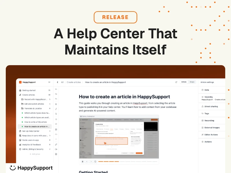
HappySupport: the doc layer that keeps onboarding accurate
HappySupport is not a tour builder. It is the help center layer that sits beside an in-app onboarding tool. The job is to keep the underlying articles current as the product ships, so the in-app tour link to "how billing works" does not dead-end on a screenshot from two releases ago. The product layer is HappyWidget for contextual in-app help, plus HappyRecorder for capturing UI flows as code-selectors rather than pixel screenshots.
Where HappySupport is best in class
Documentation freshness. The recorder captures DOM and CSS metadata, not screenshots, so when the UI changes, the underlying article updates automatically through the GitHub Sync layer. PMs use it to stop chasing stale screenshots after every release. The widget surfaces the right article inside the product at the moment of confusion, which is the unmet need that in-app tours alone cannot solve.
Where HappySupport hits the wall
Not an onboarding tour builder. If you need branching tooltips, hotspots, and modals to walk a new user through a flow, you still need Userpilot, Appcues, Chameleon, or one of the other tour tools above. HappySupport is the layer that makes the help center those tours link into worth linking to.
Verified pricing: 14-day free trial. Public pricing on the website.
Best for: SaaS PMs whose onboarding tours link out to help center articles that go stale within a release cycle.
How to choose your product onboarding stack
The honest answer is that most SaaS PMs end up running two tools, not one. Pick one in-app tour tool (Userpilot, Appcues, Chameleon, ProductFruits, or Userflow) and pair it with a doc layer (HappySupport, Help Scout Beacon, or your own help center) that stays current. The OpenView PLG Index has tracked this two-tool pattern across PLG SaaS for years.
Decision framework:
- Stage: Seed to Series A, pick ProductFruits or Userflow on price. Series B and up, evaluate Userpilot, Appcues, or Chameleon. Enterprise internal tools, WalkMe or Pendo Ultimate.
- Workflow priority: Speed-to-first-flow points to Appcues. Pixel-level UI control points to Chameleon. Public pricing and PLG fit points to Userpilot or Userflow.
- Analytics depth: If activation funnels and retention cohorts are core to the PM workflow, Pendo is the strongest single tool. If you already have Amplitude or Mixpanel, the analytics tier of any tour tool is enough.
- Documentation drift: If your help center articles go stale within a release cycle, the tour tool alone does not solve it. Layer in a self-updating help center beside the tour.
What gets missed most often: the cost of stale documentation. A tour can guide a user through a feature on day one, but the article the user finds three months later when something breaks is what determines whether they renew. The hidden cost of documentation decay compounds across every cohort.
HappySupport sits beside your tour tool, not in place of it
Every tool on this list except HappySupport is an in-app tour builder. HappySupport is the layer that keeps the underlying help center articles current as the product ships. Keep your ticketing system (Intercom, Zendesk, Help Scout, HubSpot, Freshdesk, Front, Jira Service Management), keep your tour builder (Userpilot, Appcues, Chameleon, ProductFruits, Userflow), and swap in HappySupport for the article layer that everything else links into.
This is the and-not-or pattern. The activation problem is not solved by tours alone. It is not solved by a help center alone. It is solved by an in-app guidance layer that links into help center articles that stay accurate every product release. The tour layer is mature: pick whichever of the seven tools above fits your PM workflow. The doc layer is where most SaaS PMs have a gap.
If you want to see how the doc layer works without a digital adoption platform on top, read how to add in-app help without a DAP. The pattern works beside any of the tour tools on this list.